Chapter 21 PLS regression with agroclimatic metrics
Learning goals for this lesson
- Learn how we can make use of chill and heat models when looking for temperature response phases
- Learn how to produce daily chill accumulation data and plots
- Learn how to run the
PLS_chill_forcefunction to run a PLS analysis with chilling and forcing data - Be able to delineate chilling and forcing phases from PLS outputs
- Learn how to produce a complex PLS output figure using
ggplot
21.1 Adjusting PLS for use with non-monotonic relationships
As we saw at the end of the previous lesson, the most likely reason why PLS regression failed to pick up the chilling period in relatively cold locations is that there is no monotonic relationship between temperature and chill effectiveness, i.e. warmer temperatures may either lead to less chill (when it’s fairly warm) or more chill (when it’s cold). To overcome this problem, we need to convert temperature into something that is monotonically related to chill accumulation. Maybe we can make use of the chill models we already learned about.
If PLS holds its promise to identify chilling periods, it should be responsive to the daily rate of chill accumulation. This brings us back to an old problem - we don’t really know how to quantify chill accumulation accurately, and we don’t really trust the models we have. But let’s swallow these concerns for now and do such an analysis anyway. Note that if you’re ever tempted to do such a thing - swallow concerns that you know to be valid - don’t hide this from your audience. Clearly and explicitly state what you’ve done, as well as what problems may be associated with your strategy.
So we’ll make this very clear here:
We’ll be converting temperature data to chill (and heat) accumulation to run PLS analyses. This strategy assumes that the respective chill and heat models are reasonable approximations of the underlying biology.
21.2 PLS analysis with chilling and forcing data
The chillR package has a function called PLS_chill_force that implements PLS analysis based on daily chill and heat accumulation rates. Let’s use this on our dataset of first bloom dates of ‘Alexander Lucas’ pears in Klein-Altendorf.
When you look at the documentation of the PLS_chill_force function (e.g. by typing ?PLS_chill_force), you’ll see that this function requires a daily chill object (daily_chill_obj) as an input. This object contains daily chill and heat accumulation rates, as well as mean temperature data. Check out the documentation of daily_chill for more information on this.
So we’ll start by applying the daily_chill function to produce such a daily chill object. We’ll also use a standard function in chillR (make_daily_chill_plot2) to plot daily chill accumulation:
library(chillR)
library(kableExtra)

temps<-read_tab("data/TMaxTMin1958-2019_patched.csv")
temps_hourly<-stack_hourly_temps(temps,latitude=50.6)

kable(head(temps))  %>%
kable_styling("striped", position = "left",font_size = 8)daychill<-daily_chill(hourtemps=temps_hourly,
running_mean=1,
models = list(Chilling_Hours = Chilling_Hours, Utah_Chill_Units = Utah_Model,
Chill_Portions = Dynamic_Model, GDH = GDH)
)
kable(head(daychill$daily_chill)) %>%
kable_styling("striped", position = "left",font_size = 8)dc<-make_daily_chill_plot2(daychill,metrics=c("Chill_Portions"),cumulative=FALSE,
startdate=300,enddate=30,focusyears=c(2008), metriclabels="Chill Portions")
In this plot, we can highlight specific years (with the focusyears parameter). We can also switch to cumulative view to illustrate how chill accumulation in a particular year differs from historic accumulation patterns.
dc<-make_daily_chill_plot2(daychill,metrics=c("Chill_Portions"),cumulative=TRUE,
   startdate=300,enddate=30,focusyears=c(2008), metriclabels="Chill Portions")
One special feature in this plot are the double ticks on the x-axis. These account for the additional day (29th February) that is added to the year in leap years. These leap days make Julian dates not map to precisely to the same calendar dates in each year. The double ticks are an attempt to do justice to this imprecision.
We can now feed this daily chill object to the PLS_chill_force function. We’ll also need the pear bloom data again:
Alex<-read_tab("data/Alexander_Lucas_bloom_1958_2019.csv")
Alex_first<-Alex[,1:2]
Alex_first[,"Year"]<-substr(Alex_first$First_bloom,1,4)
Alex_first[,"Month"]<-substr(Alex_first$First_bloom,5,6)
Alex_first[,"Day"]<-substr(Alex_first$First_bloom,7,8)
Alex_first<-make_JDay(Alex_first)
Alex_first<-Alex_first[,c("Pheno_year","JDay")]
colnames(Alex_first)<-c("Year","pheno")


plscf<-PLS_chill_force(daily_chill_obj=daychill,
                       bio_data_frame=Alex_first,
                       split_month=6,
                       chill_models = "Chill_Portions",
                       heat_models = "GDH")

kable(head(plscf$Chill_Portions$GDH$PLS_summary))  %>%
  kable_styling("striped", position = "left",font_size = 10)
We could have specified multiple chill and heat models, and the output would have evaluated all combinations of these models. This is why, to find the results, we have to look at plscf$Chill_Portions$GDH$PLS_summary. We can plot the results with the inbuilt function plot_PLS. Here’s how this is done:
Once again, this is a fairly old function that writes an image in a place you can specify. We’ll redo this with ggplot later.
Plot of results from the PLS_chill_force procedures, as plotted with chillR’s standard plotting function
We’ll reproduce this with ggplot soon, but you may already notice that the results don’t look very clear quite yet. To a considerable extent, this is because we didn’t use a running mean to smooth the chill and heat data. Especially for the Dynamic Model, this is worth considering, because Chill Portions accumulate in a stepwise manner, rather than continuously. Such steps aren’t reached every day, which adds a random element to estimations of daily rates. Let’s apply an 11-day running mean and plot the results again:
plscf<-PLS_chill_force(daily_chill_obj=daychill,
                       bio_data_frame=Alex_first,
                       split_month=6,
                       chill_models = "Chill_Portions",
                       heat_models = "GDH",
                       runn_means = 11)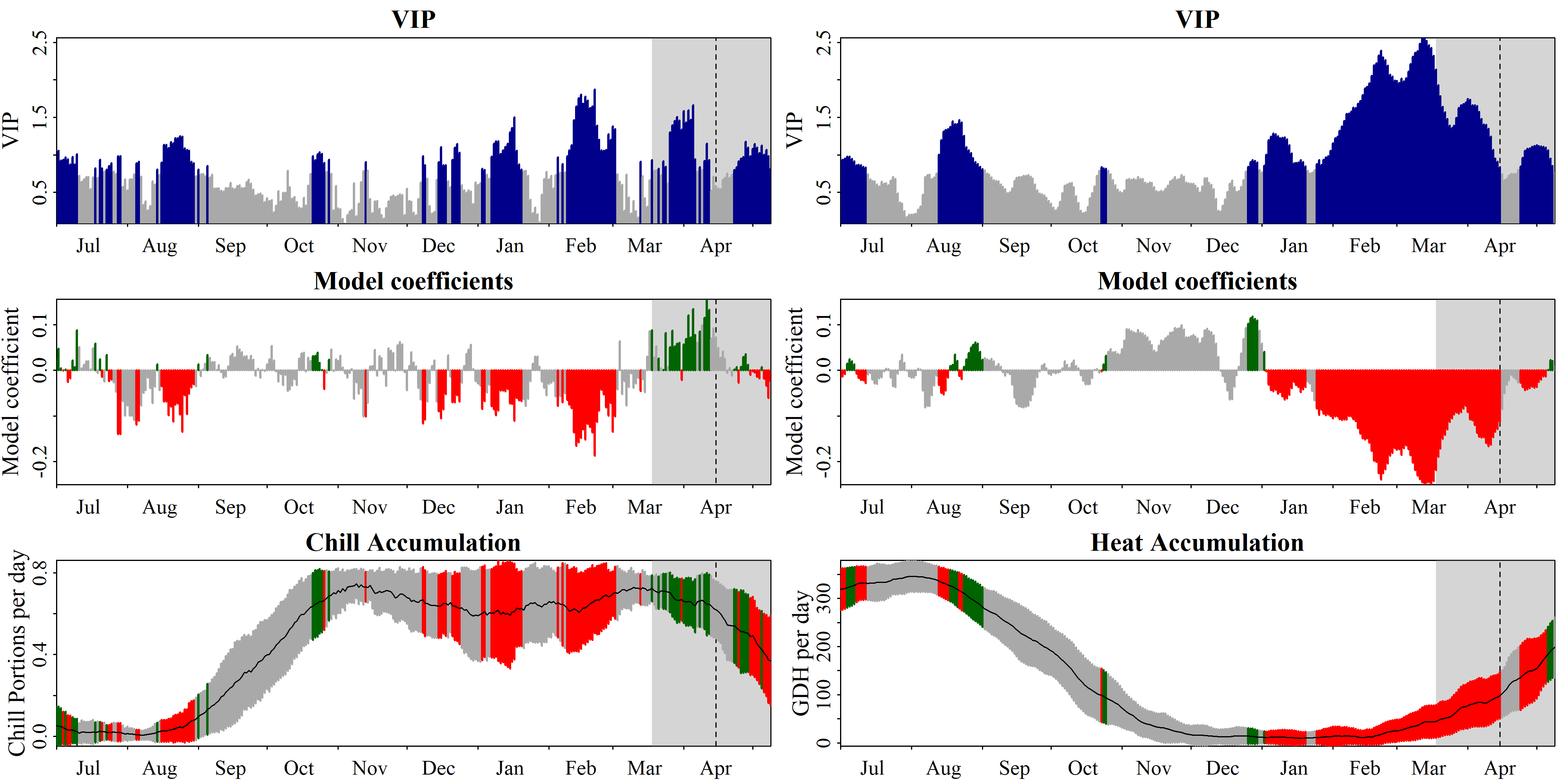
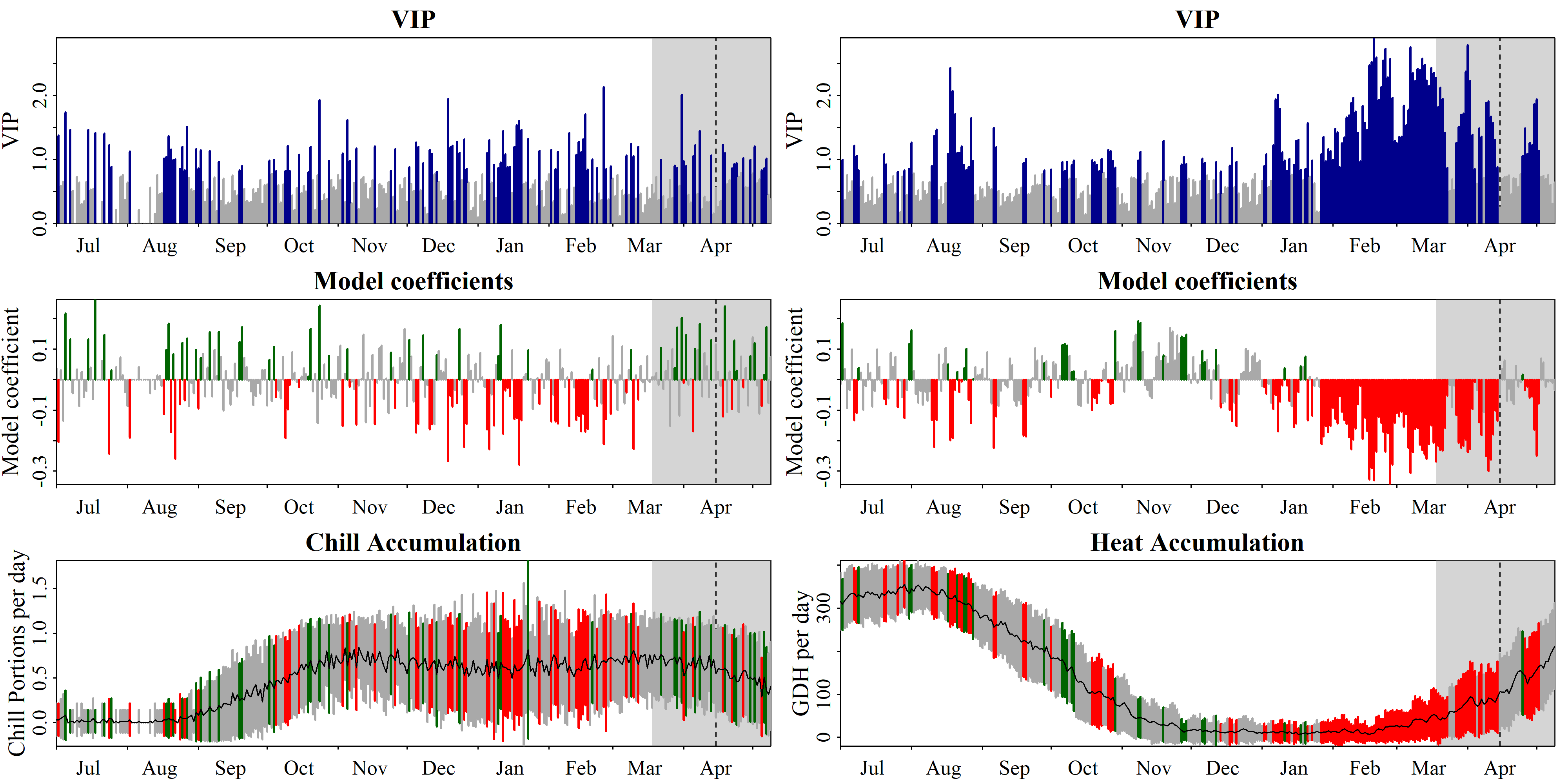
Plot of results from the PLS_chill_force procedures, with an 11-day running mean applied to chill and heat inputs, as plotted with chillR’s standard plotting function
This looks a lot clearer now. We see two plots here, with the one on the left showing the relationship between bloom dates and chill accumulation, and the one on the right showing the same for heat accumulation. Note that these are plotted in different panels, but they emerged from the same PLS analysis, which thus related bloom dates to a total of 730 independent variables - chill and heat accumulation dates for each calendar day (if you select end_at_pheno_end=TRUE, minus all days after the latest bloom date).
To find the chilling and forcing periods, we should now look for consistent periods of negative model coefficients on both sides of the figure. For the chilling period, we’ll look on the left, where the relationship of bloom dates with daily chill accumulation rates is shown, and for the forcing period, we’ll look right, where the same is shown for daily heat accumulation rates.
Again, the forcing period is easier to see than the chilling phase. It’s approximately between early January and the bloom date (between mid-March and early May). The chilling period is still a bit hard to see, but we can now detect a phase between some point in November or early December and February, where high chill accumulation rates are correlated with early bloom.
In these delineations, I recommend to not focus too narrowly on ‘important’ values, but rather take a broad perspective in evaluating model coefficient dynamics. Always remember that PLS regression with small datasets may struggle to distinguish signals from noise, with random effects easily creeping in. We also need to remember that our chill and heat models aren’t perfect and that they don’t actually include much knowledge on dormancy physiology.
We’ll discuss some more reasons for poor chilling period delineations later.
21.3 Delineating chilling and forcing periods
The precise delineations of chilling and forcing periods are often a bit debatable, and there have often been slight disagreements about the precise dates to use. I would recommend taking both the plot and the detailed results table into account in deciding when periods start and end. More importantly, consider what you know about tree dormancy! Never lose sight of the ecological theory behind your analysis, when you evaluate the results.
My call on the present dataset would be a chilling period between 13th November and 3rd March (Julian dates -48 to 62) and a forcing period between 26th December and the date of bloom (Julian dates -5 to 105.5, which represents the median of all bloom dates). We can illustrate these periods in the plot:

Plot of PLS_chill_force results, with our delineations of chilling (light blue) and forcing (light red) phases highlighted
21.4 ggplotting the results
We’ve gone through most of what we need here already, when we made the original PLS plots, but let’s do this again for the PLS_chill_force outputs. The only real change is that we need to split the results according to chill vs. heat analysis. We’ll use facet_wrap for this.
First we need to prepare the data for ggplotting:
PLS_gg<-plscf$Chill_Portions$GDH$PLS_summary
PLS_gg[,"Month"]<-trunc(PLS_gg$Date/100)
PLS_gg[,"Day"]<-PLS_gg$Date-PLS_gg$Month*100
PLS_gg[,"Date"]<-ISOdate(2002,PLS_gg$Month,PLS_gg$Day)
PLS_gg[which(PLS_gg$JDay<=0),"Date"]<-
  ISOdate(2001,
          PLS_gg$Month[which(PLS_gg$JDay<=0)],
          PLS_gg$Day[which(PLS_gg$JDay<=0)])
PLS_gg[,"VIP_importance"]<-PLS_gg$VIP>=0.8
PLS_gg[,"VIP_Coeff"]<-factor(sign(PLS_gg$Coef)*PLS_gg$VIP_importance)

chill_start_JDay<--48
chill_end_JDay<-62
heat_start_JDay<--5
heat_end_JDay<-105.5

chill_start_date<-ISOdate(2001,12,31)+chill_start_JDay*24*3600
chill_end_date<-ISOdate(2001,12,31)+chill_end_JDay*24*3600
heat_start_date<-ISOdate(2001,12,31)+heat_start_JDay*24*3600
heat_end_date<-ISOdate(2001,12,31)+heat_end_JDay*24*3600
This time we’ll start with the bottom plot, because that’s the most complicated one. It’s complicated, because we need to put different labels on the y-axes of the two facets. Since the daily chill accumulation rate is between 0 and ~1 Chill Portions, and the heat accumulation rate can reach 300 GDH and more, we also need different scales for the axes. We’ll start with the hardest plot, because the way we solve these problems may have implications for how we have to construct the other plots.
library(ggplot2)

temp_plot<- ggplot(PLS_gg,x=Date) +
  annotate("rect",
           xmin = chill_start_date,
           xmax = chill_end_date,
           ymin = -Inf,
           ymax = Inf,
           alpha = .1,fill = "blue") +
  annotate("rect",
           xmin = heat_start_date,
           xmax = heat_end_date,
           ymin = -Inf,
           ymax = Inf,
           alpha = .1,fill = "red") +
  annotate("rect",
           xmin = ISOdate(2001,12,31) +
             min(plscf$pheno$pheno,na.rm=TRUE)*24*3600,
           xmax = ISOdate(2001,12,31) +
             max(plscf$pheno$pheno,na.rm=TRUE)*24*3600,
           ymin = -Inf,
           ymax = Inf,
           alpha = .1,fill = "black") +
  geom_vline(xintercept = ISOdate(2001,12,31) +
               median(plscf$pheno$pheno,na.rm=TRUE)*24*3600,
             linetype = "dashed") +
  geom_ribbon(aes(x=Date,
                  ymin=MetricMean - MetricStdev ,
                  ymax=MetricMean + MetricStdev ),
              fill="grey") +
  geom_ribbon(aes(x=Date,
                  ymin=MetricMean - MetricStdev * (VIP_Coeff==-1),
                  ymax=MetricMean + MetricStdev * (VIP_Coeff==-1)),
              fill="red") +
  geom_ribbon(aes(x=Date,
                  ymin=MetricMean - MetricStdev * (VIP_Coeff==1),
                  ymax=MetricMean + MetricStdev * (VIP_Coeff==1)),
              fill="dark green") +
  geom_line(aes(x=Date,y=MetricMean ))

temp_plot
temp_plot<- temp_plot +
  facet_wrap(vars(Type), scales = "free_y",
             strip.position="left",
             labeller = labeller(Type = as_labeller(
               c(Chill="Chill (CP)",Heat="Heat (GDH)")))) +
  ggtitle("Daily chill and heat accumulation rates") +
  theme_bw(base_size=15) +
  theme(strip.background = element_blank(),
        strip.placement = "outside",
        strip.text.y = element_text(size =12),
        plot.title = element_text(hjust = 0.5),
        axis.title.y=element_blank()
        )

temp_plot
I looked around a bit for an honest way to customize the y-axis labels for each facet, but didn’t find a viable solution. So I used the facet labels instead and moved them to the left side, using them as y-axis labels. The labeller element in facet_wrap can easily be customized with text of your choice. I also added a title to the plot.
We can now use the same strategy to make the VIP and model coefficient plots (this is important, because the plots should have similar structures when we combine them later).
VIP_plot<- ggplot(PLS_gg,aes(x=Date,y=VIP)) +
  annotate("rect",
           xmin = chill_start_date,
           xmax = chill_end_date,
           ymin = -Inf,
           ymax = Inf,
           alpha = .1,fill = "blue") +
  annotate("rect",
           xmin = heat_start_date,
           xmax = heat_end_date,
           ymin = -Inf,
           ymax = Inf,
           alpha = .1,fill = "red") +
  annotate("rect",
           xmin = ISOdate(2001,12,31) +
             min(plscf$pheno$pheno,na.rm=TRUE)*24*3600,
           xmax = ISOdate(2001,12,31) +
             max(plscf$pheno$pheno,na.rm=TRUE)*24*3600,
           ymin = -Inf,
           ymax = Inf,
           alpha = .1,fill = "black") +
  geom_vline(xintercept = ISOdate(2001,12,31) +
               median(plscf$pheno$pheno,na.rm=TRUE)*24*3600,
             linetype = "dashed") +
  geom_bar(stat='identity',aes(fill=VIP>0.8))

VIP_plot
VIP_plot <- VIP_plot + facet_wrap(vars(Type), scales="free",
             strip.position="left",
             labeller = labeller(Type = as_labeller(
               c(Chill="VIP for chill",Heat="VIP for heat")))) +
  scale_y_continuous(
    limits=c(0,max(plscf$Chill_Portions$GDH$PLS_summary$VIP))) +
  ggtitle("Variable Importance in the Projection (VIP) scores") +
  theme_bw(base_size=15) +
  theme(strip.background = element_blank(),
        strip.placement = "outside",
        strip.text.y = element_text(size =12),
        plot.title = element_text(hjust = 0.5),
        axis.title.y=element_blank()
        )

VIP_plot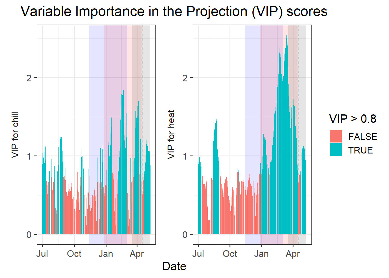
VIP_plot <- VIP_plot +
  scale_fill_manual(name="VIP",
                    labels = c("<0.8", ">0.8"),
                    values = c("FALSE"="grey", "TRUE"="blue")) +
  theme(axis.text.x = element_blank(),
        axis.ticks.x = element_blank(),
        axis.title.x = element_blank(),
        axis.title.y = element_blank())

VIP_plot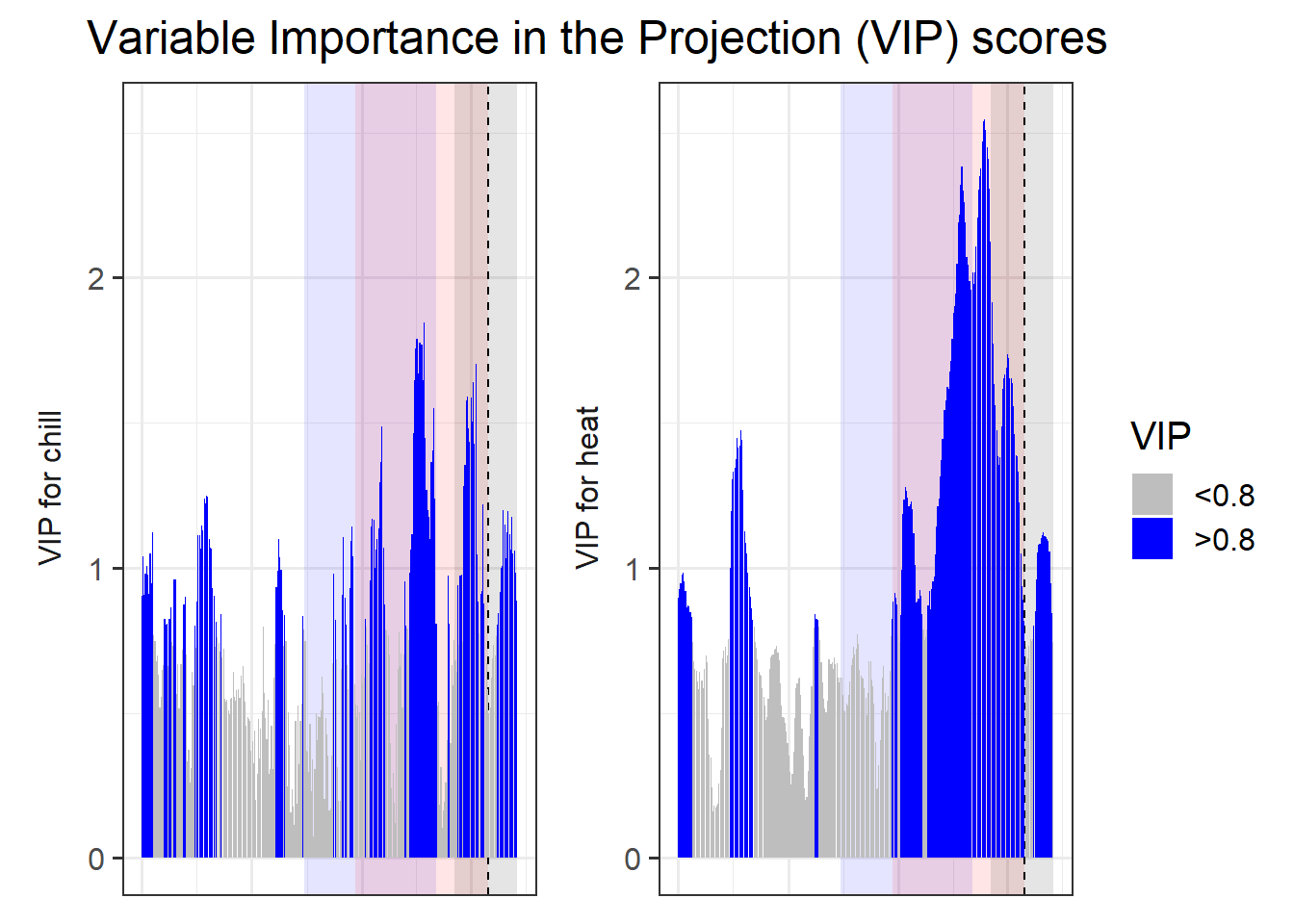
coeff_plot<- ggplot(PLS_gg,aes(x=Date,y=Coef)) +
  annotate("rect",
           xmin = chill_start_date,
           xmax = chill_end_date,
           ymin = -Inf,
           ymax = Inf,
           alpha = .1,fill = "blue") +
  annotate("rect",
           xmin = heat_start_date,
           xmax = heat_end_date,
           ymin = -Inf,
           ymax = Inf,
           alpha = .1,fill = "red") +
  annotate("rect",
           xmin = ISOdate(2001,12,31) +
             min(plscf$pheno$pheno,na.rm=TRUE)*24*3600,
           xmax = ISOdate(2001,12,31) +
             max(plscf$pheno$pheno,na.rm=TRUE)*24*3600,
           ymin = -Inf,
           ymax = Inf,
           alpha = .1,fill = "black") +
  geom_vline(xintercept = ISOdate(2001,12,31) +
               median(plscf$pheno$pheno,na.rm=TRUE)*24*3600,
             linetype = "dashed") +
  geom_bar(stat='identity',aes(fill=VIP_Coeff))

coeff_plot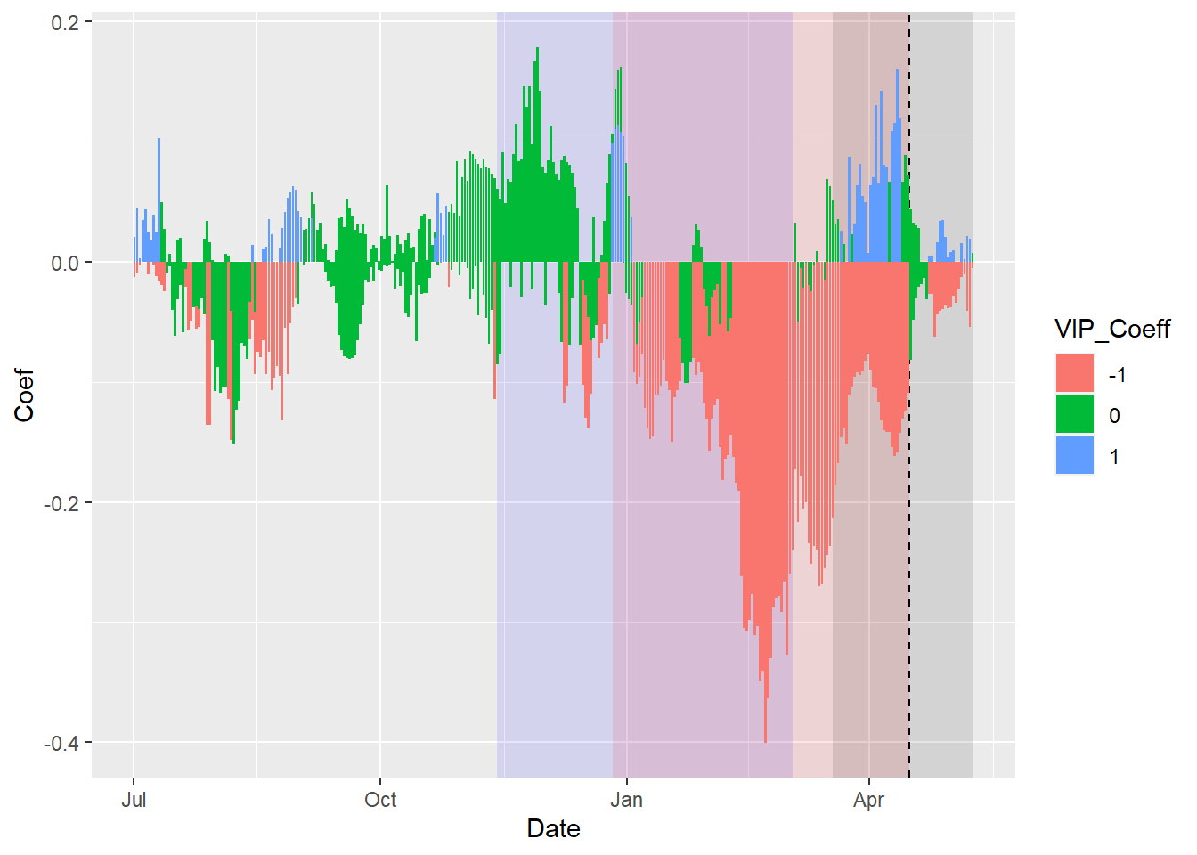
coeff_plot <- coeff_plot + facet_wrap(vars(Type), scales="free",
             strip.position="left",
             labeller = labeller(
               Type = as_labeller(
                 c(Chill="MC for chill",Heat="MC for heat")))) +
  scale_y_continuous(
    limits=c(min(plscf$Chill_Portions$GDH$PLS_summary$Coef),
             max(plscf$Chill_Portions$GDH$PLS_summary$Coef))) +
  ggtitle("Model coefficients (MC)") +
  theme_bw(base_size=15) +
  theme(strip.background = element_blank(),
        strip.placement = "outside",
        strip.text.y = element_text(size =12),
        plot.title = element_text(hjust = 0.5),
        axis.title.y=element_blank()
        )

coeff_plot 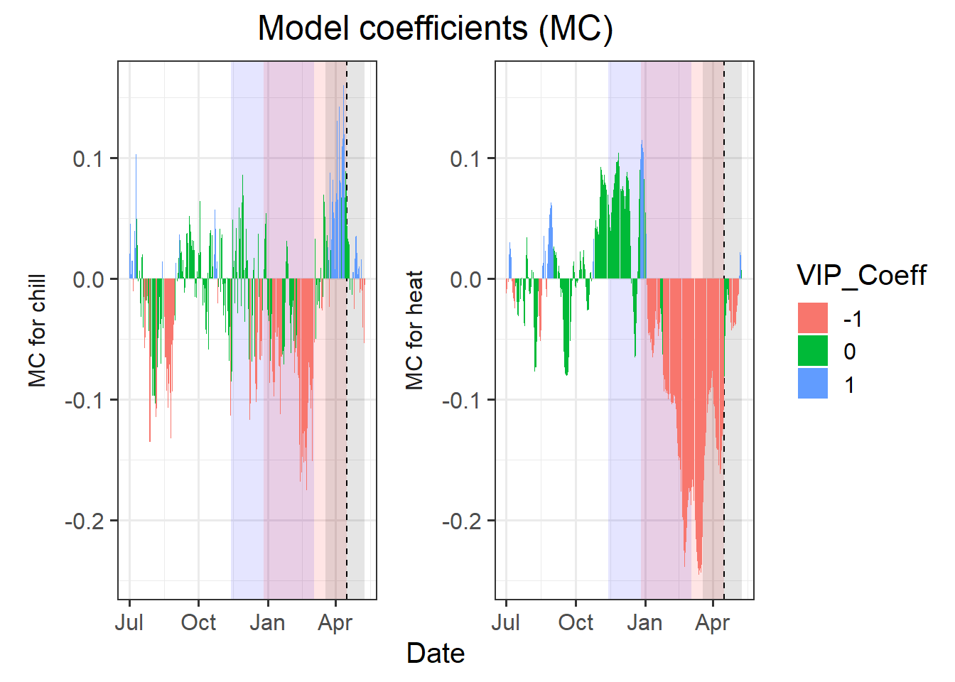
coeff_plot <- coeff_plot +  scale_fill_manual(name="Effect direction",
                    labels = c("Advancing", "Unimportant","Delaying"),
                    values = c("-1"="red", "0"="grey","1"="dark green")) +
  ylab("PLS coefficient") +
  theme(axis.text.x = element_blank(),
        axis.ticks.x = element_blank(),
        axis.title.x = element_blank(),
        axis.title.y = element_blank())

coeff_plot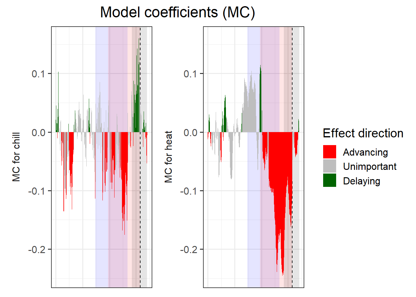
Now it’s time to combine the plots. We’ll use the patchwork package again.
library(patchwork)

plot<- (VIP_plot +
          coeff_plot +
          temp_plot +
          plot_layout(ncol=1,
            guides = "collect")
        ) & theme(legend.position = "right",
                  legend.text = element_text(size=8),
                  legend.title = element_text(size=10),
                  axis.title.x=element_blank())

plot
Since I like what we’ve produced here, I’ll make a function out of it.
plot_PLS_chill_force<-function(plscf,
                               chill_metric="Chill_Portions",
                               heat_metric="GDH",
                               chill_label="CP",
                               heat_label="GDH",
                               chill_phase=c(-48,62),
                               heat_phase=c(-5,105.5))
{
  PLS_gg<-plscf[[chill_metric]][[heat_metric]]$PLS_summary
  PLS_gg[,"Month"]<-trunc(PLS_gg$Date/100)
  PLS_gg[,"Day"]<-PLS_gg$Date-PLS_gg$Month*100
  PLS_gg[,"Date"]<-ISOdate(2002,PLS_gg$Month,PLS_gg$Day)
  PLS_gg[which(PLS_gg$JDay<=0),"Date"]<-ISOdate(2001,PLS_gg$Month[which(PLS_gg$JDay<=0)],PLS_gg$Day[which(PLS_gg$JDay<=0)])
  PLS_gg[,"VIP_importance"]<-PLS_gg$VIP>=0.8
  PLS_gg[,"VIP_Coeff"]<-factor(sign(PLS_gg$Coef)*PLS_gg$VIP_importance)

  chill_start_date<-ISOdate(2001,12,31)+chill_phase[1]*24*3600
  chill_end_date<-ISOdate(2001,12,31)+chill_phase[2]*24*3600
  heat_start_date<-ISOdate(2001,12,31)+heat_phase[1]*24*3600
  heat_end_date<-ISOdate(2001,12,31)+heat_phase[2]*24*3600


  temp_plot<- ggplot(PLS_gg) +
    annotate("rect",
             xmin = chill_start_date,
             xmax = chill_end_date,
             ymin = -Inf,
             ymax = Inf,
             alpha = .1,fill = "blue") +
    annotate("rect",
             xmin = heat_start_date,
             xmax = heat_end_date,
             ymin = -Inf,
             ymax = Inf,
             alpha = .1,fill = "red") +
    annotate("rect",
             xmin = ISOdate(2001,12,31) + min(plscf$pheno$pheno,na.rm=TRUE)*24*3600,
             xmax = ISOdate(2001,12,31) + max(plscf$pheno$pheno,na.rm=TRUE)*24*3600,
             ymin = -Inf,
             ymax = Inf,
             alpha = .1,fill = "black") +
    geom_vline(xintercept = ISOdate(2001,12,31) + median(plscf$pheno$pheno,na.rm=TRUE)*24*3600, linetype = "dashed") +
    geom_ribbon(aes(x=Date,
                    ymin=MetricMean - MetricStdev ,
                    ymax=MetricMean + MetricStdev ),
                fill="grey") +
    geom_ribbon(aes(x=Date,
                    ymin=MetricMean - MetricStdev * (VIP_Coeff==-1),
                    ymax=MetricMean + MetricStdev * (VIP_Coeff==-1)),
                fill="red") +
    geom_ribbon(aes(x=Date,
                    ymin=MetricMean - MetricStdev * (VIP_Coeff==1),
                    ymax=MetricMean + MetricStdev * (VIP_Coeff==1)),
                fill="dark green") +
    geom_line(aes(x=Date,y=MetricMean )) +
    facet_wrap(vars(Type), scales = "free_y",
               strip.position="left",
               labeller = labeller(Type = as_labeller(c(Chill=paste0("Chill (",chill_label,")"),Heat=paste0("Heat (",heat_label,")")) )) ) +
    ggtitle("Daily chill and heat accumulation rates") +
    theme_bw(base_size=15) +
    theme(strip.background = element_blank(),
          strip.placement = "outside",
          strip.text.y = element_text(size =12),
          plot.title = element_text(hjust = 0.5),
          axis.title.y=element_blank()
          )

  VIP_plot<- ggplot(PLS_gg,aes(x=Date,y=VIP)) +
    annotate("rect",
             xmin = chill_start_date,
             xmax = chill_end_date,
             ymin = -Inf,
             ymax = Inf,
             alpha = .1,fill = "blue") +
    annotate("rect",
             xmin = heat_start_date,
             xmax = heat_end_date,
             ymin = -Inf,
             ymax = Inf,
             alpha = .1,fill = "red") +
    annotate("rect",
             xmin = ISOdate(2001,12,31) + min(plscf$pheno$pheno,na.rm=TRUE)*24*3600,
             xmax = ISOdate(2001,12,31) + max(plscf$pheno$pheno,na.rm=TRUE)*24*3600,
             ymin = -Inf,
             ymax = Inf,
             alpha = .1,fill = "black") +
    geom_vline(xintercept = ISOdate(2001,12,31) + median(plscf$pheno$pheno,na.rm=TRUE)*24*3600, linetype = "dashed") +
    geom_bar(stat='identity',aes(fill=VIP>0.8)) +
    facet_wrap(vars(Type), scales="free",
               strip.position="left",
               labeller = labeller(Type = as_labeller(c(Chill="VIP for chill",Heat="VIP for heat") )) ) +
    scale_y_continuous(limits=c(0,max(plscf[[chill_metric]][[heat_metric]]$PLS_summary$VIP))) +
    ggtitle("Variable Importance in the Projection (VIP) scores") +
    theme_bw(base_size=15) +
    theme(strip.background = element_blank(),
          strip.placement = "outside",
          strip.text.y = element_text(size =12),
          plot.title = element_text(hjust = 0.5),
          axis.title.y=element_blank()
          ) +
    scale_fill_manual(name="VIP",
                      labels = c("<0.8", ">0.8"),
                      values = c("FALSE"="grey", "TRUE"="blue")) +
    theme(axis.text.x = element_blank(),
          axis.ticks.x = element_blank(),
          axis.title.x = element_blank(),
          axis.title.y = element_blank())

  coeff_plot<- ggplot(PLS_gg,aes(x=Date,y=Coef)) +
    annotate("rect",
             xmin = chill_start_date,
             xmax = chill_end_date,
             ymin = -Inf,
             ymax = Inf,
             alpha = .1,fill = "blue") +
    annotate("rect",
             xmin = heat_start_date,
             xmax = heat_end_date,
             ymin = -Inf,
             ymax = Inf,
             alpha = .1,fill = "red") +
    annotate("rect",
             xmin = ISOdate(2001,12,31) + min(plscf$pheno$pheno,na.rm=TRUE)*24*3600,
             xmax = ISOdate(2001,12,31) + max(plscf$pheno$pheno,na.rm=TRUE)*24*3600,
             ymin = -Inf,
             ymax = Inf,
             alpha = .1,fill = "black") +
    geom_vline(xintercept = ISOdate(2001,12,31) + median(plscf$pheno$pheno,na.rm=TRUE)*24*3600, linetype = "dashed") +
    geom_bar(stat='identity',aes(fill=VIP_Coeff)) +
    facet_wrap(vars(Type), scales="free",
               strip.position="left",
               labeller = labeller(Type = as_labeller(c(Chill="MC for chill",Heat="MC for heat") )) ) +
    scale_y_continuous(limits=c(min(plscf[[chill_metric]][[heat_metric]]$PLS_summary$Coef),
                                max(plscf[[chill_metric]][[heat_metric]]$PLS_summary$Coef))) +
    ggtitle("Model coefficients (MC)") +
    theme_bw(base_size=15) +
    theme(strip.background = element_blank(),
          strip.placement = "outside",
          strip.text.y = element_text(size =12),
          plot.title = element_text(hjust = 0.5),
          axis.title.y=element_blank()
          ) +
    scale_fill_manual(name="Effect direction",
                      labels = c("Advancing", "Unimportant","Delaying"),
                      values = c("-1"="red", "0"="grey","1"="dark green")) +
    ylab("PLS coefficient") +
    theme(axis.text.x = element_blank(),
          axis.ticks.x = element_blank(),
          axis.title.x = element_blank(),
          axis.title.y = element_blank())

  library(patchwork)

  plot<- (VIP_plot +
            coeff_plot +
            temp_plot +
            plot_layout(ncol=1,
                        guides = "collect")
          ) & theme(legend.position = "right",
                    legend.text = element_text(size=8),
                    legend.title = element_text(size=10),
                    axis.title.x=element_blank())

plot

}

plot_PLS_chill_force(plscf)
Now that we’ve automated the plot production, we can easily look at how useful other chill models would be in delineating chilling and forcing periods.
daychill<-daily_chill(hourtemps=temps_hourly,
            running_mean=11,
            models = list(Chilling_Hours = Chilling_Hours, Utah_Chill_Units = Utah_Model,
    Chill_Portions = Dynamic_Model, GDH = GDH)
    )

plscf<-PLS_chill_force(daily_chill_obj=daychill,
                       bio_data_frame=Alex_first,
                       split_month=6,
                       chill_models = c("Chilling_Hours", "Utah_Chill_Units", "Chill_Portions"),
                       heat_models = c("GDH"))

plot_PLS_chill_force(plscf,
                     chill_metric="Chilling_Hours",
                     heat_metric="GDH",
                     chill_label="CH",
                     heat_label="GDH",
                     chill_phase=c(0,0),
                     heat_phase=c(0,0))
plot_PLS_chill_force(plscf,
                     chill_metric="Utah_Chill_Units",
                     heat_metric="GDH",
                     chill_label="CU",
                     heat_label="GDH",
                     chill_phase=c(0,0),
                     heat_phase=c(0,0))
So the other two common models aren’t so great at picking up the chilling period either. We’ll reflect on why this is happening later.
Exercises on chill model comparison
Please document all results of the following assignments in your learning logbook.
- Repeat the
PLS_chill_forceprocedure for the ‘Roter Boskoop’ dataset. Include plots of daily chill and heat accumulation. - Run
PLS_chill_forceanalyses for all three major chill models. Delineate your best estimates of chilling and forcing phases for all of them. - Plot results for all three analyses, including shaded plot areas for the chilling and forcing periods you estimated.