Chapter 23 Why PLS doesn’t always work
Learning goals for this lesson
- Understand why PLS regression sometimes doesn’t perform as expected
- Be able to make temperature response plots for agroclimatic metrics
- Be able to relate temperatures at a study site to temperature responses of models to anticipate whether PLS analysis will be effective
23.1 Disappointing PLS performance
As we’ve seen in the previous chapter, results from PLS regression often don’t allow easy delineation of temperature response phases, especially when it comes to the chilling period. This problem didn’t really go away after replacing temperatures with agroclimatic metrics in the analysis. In many cases, we saw some short periods that matched the expected pattern, but these often only occurred at the beginning and end of the likely endodormancy phase, with a large gap between them.
To understand what’s going on here, we have to remind ourselves of what the analysis procedure we’re using can accomplish - and what it can’t.
23.2 What PLS regression can find
What PLS looks for is responses of a response variable to variation in the input variable. We’ve already learned earlier that this response should be monotonic, i.e. the response (bloom date) should be either positively or negatively correlated with the input variables. The sign of this relationship should not change halfway through the range of the input variables.
Another prerequisite for a successful PLS regression, which may seem so obvious that we usually don’t pay much attention to it, is that there needs to be meaningful variation in the signal variables in the first place. If the independent variables don’t vary, we obviously can’t detect a response to variation. In the specific example we’re looking at, if chill effectiveness is always more or less the same during a certain period, we can’t expect PLS regression to derive much useful information on the temperature response during this phase.
Let’s explore whether the reason for poor PLS performance might be low variation in chill accumulation during particular periods, in particular during the winter in cold study locations, such as Klein-Altendorf or Beijing. We’ll start by making a plot of the model response to temperature.
I’m only going to work with the Dynamic Model now, but we could of course do similar analyses with other chill models (in case we’re still not convinced that the Dynamic Model is superior).
What we’ll do now is produce a figure that shows how the Dynamic Model responds to particular daily temperature curves. For simplicity, I’ll assume that we have the same minimum and maximum temperature over a longer period and then compute the mean daily chill accumulation rate. This is preferable to a single-day calculation, because the Dynamic Model sometimes takes multiple days to accumulate a Chill Portion.
library(chillR)

mon<-1 # Month
ndays<-31 # Number of days per month
tmin<-1
tmax<-8
latitude<-50


weather<-make_all_day_table(data.frame(Year=c(2001,2002),
                                         Month=c(mon,mon),
                                         Day=c(1,ndays),Tmin=c(0,0),Tmax=c(0,0)))

weather$Tmin<-tmin
weather$Tmax<-tmax

hourly_temps<-stack_hourly_temps(weather,latitude=latitude)

CPs<-Dynamic_Model(hourly_temps$hourtemps$Temp)
daily_CPs<-CPs[length(CPs)]/nrow(weather)

daily_CPs
## [1] 0.7575865To be able to add flexibility to the code later, let me introduce an alternative way to run a function. So far, we’ve been running the Dynamic_Model function by typing Dynamic_Model(...). This is easy and straightforward, but assume now that we’d like our function to be able to run different models, and we want to pass the model into our function as a parameter. In such cases, we can use the do.call function: do.call(temp_model, list(...)). The list here contains all the arguments to the temperature model function. In our original case, temp_model would be equal to Dynamic_Model (and the list would contain the arguments of the Dynamic_Model function), but we could now replace it by temp_model=GDH or a similar expression.
So far we’ve just been working on one particular Tmin/Tmax combination, and we only generated results for one month. Let’s produce such data for each month, and for a wide range of Tmin/Tmax combinations. We’ll need a bit of slightly more complicated code here to solve some problems that come up when we try to generalize, such as the need to figure out how many days each month has.
library(chillR)

latitude<-50.6

month_range<-c(10,11,12,1,2,3)

Tmins=c(-20:20)
Tmaxs=c(-15:30)

mins<-NA
maxs<-NA
CP<-NA
month<-NA
temp_model<-Dynamic_Model

for(mon in month_range)
    {days_month<-as.numeric(difftime( ISOdate(2002,mon+1,1),
                                           ISOdate(2002,mon,1) ))
    if(mon==12) days_month<-31
    weather<-make_all_day_table(data.frame(Year=c(2001,2002),
                                         Month=c(mon,mon),
                                         Day=c(1,days_month),Tmin=c(0,0),Tmax=c(0,0)))
    for(tmin in Tmins)
      for(tmax in Tmaxs)
        if(tmax>=tmin)
          {
          weather$Tmin<-tmin
          weather$Tmax<-tmax
          hourtemps<-stack_hourly_temps(weather,
                                        latitude=latitude)$hourtemps$Temp
          CP<-c(CP,do.call(Dynamic_Model,
                           list(hourtemps))[length(hourtemps)]/(length(hourtemps)/24))
          mins<-c(mins,tmin)
          maxs<-c(maxs,tmax)
          month<-c(month,mon)
        }
    }
results<-data.frame(Month=month,Tmin=mins,Tmax=maxs,CP)
results<-results[!is.na(results$Month),]


write.csv(results,"data/model_sensitivity_development.csv",row.names = FALSE)library(kableExtra)
kable(head(results)) %>%
kable_styling("striped", position = "left", font_size=10)Now we can make a plot of this temperature response curve.
library(ggplot2)
library(colorRamps)

results$Month_names<- factor(results$Month, levels=month_range,
                             labels=month.name[month_range])

DM_sensitivity<-ggplot(results,aes(x=Tmin,y=Tmax,fill=CP)) +
  geom_tile() +
  scale_fill_gradientn(colours=alpha(matlab.like(15), alpha = .5),
                       name="Chill/day (CP)") +
  ylim(min(results$Tmax),max(results$Tmax)) +
  ylim(min(results$Tmin),max(results$Tmin))

DM_sensitivity
DM_sensitivity <- DM_sensitivity +
  facet_wrap(vars(Month_names)) +
  ylim(min(results$Tmax),max(results$Tmax)) +
  ylim(min(results$Tmin),max(results$Tmin))

DM_sensitivity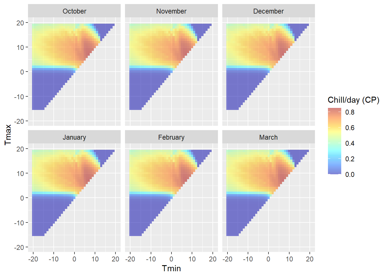
(the reason why the colors in the upper plot seem more vibrant than the colors in the legend is that the alpha function in the ggplot call makes the colors transparent - but we’re plotting data points for 6 months on top of each other. Six layers of transparent tiles make for pretty vibrant colors.)
Note that this plot is specific to the latitude we entered above, because daily temperature curves are influenced by sunrise and sunset times. We can see clear variation in chill effectiveness across the temperature spectrum, with no chill accumulation at high and low temperatures and a sweet spot in the middle. We also see that there is a fairly steep gradient in chill accumulation rates around the edge of the effective range.
We can get an important indication of the likelihood of PLS regression to work in this climatic situation by plotting temperatures on top of this diagram. This plot is specific to latitude 50.6°N, so we can overlay temperatures for Klein-Altendorf.
temperatures<-read_tab("data/TMaxTMin1958-2019_patched.csv")

temperatures<-temperatures[which(temperatures$Month %in% month_range),]

temperatures[which(temperatures$Tmax<temperatures$Tmin),
             c("Tmax","Tmin")]<-NA

temperatures$Month_names = factor(temperatures$Month,
                                  levels=c(10,11,12,1,2,3),
                                  labels=c("October","November",
                                           "December","January",
                                           "February","March"))

DM_sensitivity +
  geom_point(data=temperatures,aes(x=Tmin,y=Tmax,fill=NULL,
                                   color="Temperature"),size=0.2) +
  facet_wrap(vars(Month_names)) +
  scale_color_manual(values = "black",
                     labels = "Daily temperature \nextremes (°C)",
                     name="Observed at site" ) +
  guides(fill = guide_colorbar(order = 1),
         color = guide_legend(order = 2)) +
  ylab("Tmax (°C)") +
  xlab("Tmin (°C)") +
theme_bw(base_size=15) 
Before we start looking at the results in detail, let’s automate this procedure and also generate data for some of the other locations we’ve seen PLS results for. I’ll make two functions: one for producing the model sensitivity data (because that takes a while) and another one for plotting.
Chill_model_sensitivity<-
  function(latitude,
           temp_models=list(Dynamic_Model=Dynamic_Model,GDH=GDH),
           month_range=c(10,11,12,1,2,3),
           Tmins=c(-10:20),
           Tmaxs=c(-5:30))
  {
  mins<-NA
  maxs<-NA
  metrics<-as.list(rep(NA,length(temp_models)))
  names(metrics)<-names(temp_models)
  month<-NA

  for(mon in month_range)
    {
    days_month<-as.numeric(difftime( ISOdate(2002,mon+1,1),
                                      ISOdate(2002,mon,1) ))
    if(mon==12) days_month<-31
    weather<-make_all_day_table(data.frame(Year=c(2001,2002),
                                           Month=c(mon,mon),
                                           Day=c(1,days_month),
                                           Tmin=c(0,0),Tmax=c(0,0)))


    for(tmin in Tmins)
      for(tmax in Tmaxs)
        if(tmax>=tmin)
          {
          weather$Tmin<-tmin
          weather$Tmax<-tmax
          hourtemps<-stack_hourly_temps(weather,
                                        latitude=latitude)$hourtemps$Temp
          for(tm in 1:length(temp_models))
           metrics[[tm]]<-c(metrics[[tm]],
                            do.call(temp_models[[tm]],
                                    list(hourtemps))[length(hourtemps)]/
                              (length(hourtemps)/24))
          mins<-c(mins,tmin)
          maxs<-c(maxs,tmax)
          month<-c(month,mon)
        }
    }
  results<-cbind(data.frame(Month=month,Tmin=mins,Tmax=maxs),
                 as.data.frame(metrics))
  results<-results[!is.na(results$Month),]
}


Chill_sensitivity_temps<-function(chill_model_sensitivity_table,
                                  temperatures,
                                  temp_model,
                                  month_range=c(10,11,12,1,2,3),
                                  Tmins=c(-10:20),
                                  Tmaxs=c(-5:30),
                                  legend_label="Chill/day (CP)")
{
  library(ggplot2)
  library(colorRamps)

  cmst<-chill_model_sensitivity_table
  cmst<-cmst[which(cmst$Month %in% month_range),]
  cmst$Month_names<- factor(cmst$Month, levels=month_range,
                            labels=month.name[month_range])

  DM_sensitivity<-
    ggplot(cmst,
           aes_string(x="Tmin",y="Tmax",fill=temp_model)) +
    geom_tile() +
    scale_fill_gradientn(colours=alpha(matlab.like(15), alpha = .5),
                         name=legend_label) +
    xlim(Tmins[1],Tmins[length(Tmins)]) +
    ylim(Tmaxs[1],Tmaxs[length(Tmaxs)])

  temperatures<-
    temperatures[which(temperatures$Month %in% month_range),]
  temperatures[which(temperatures$Tmax<temperatures$Tmin),
               c("Tmax","Tmin")]<-NA
  temperatures$Month_names <-
    factor(temperatures$Month,
           levels=month_range,
           labels=month.name[month_range])

  DM_sensitivity +
    geom_point(data=temperatures,
               aes(x=Tmin,y=Tmax,fill=NULL,color="Temperature"),
               size=0.2) +
    facet_wrap(vars(Month_names)) +
    scale_color_manual(values = "black",
                       labels = "Daily temperature \nextremes (°C)",
                       name="Observed at site" ) +
    guides(fill = guide_colorbar(order = 1),
           color = guide_legend(order = 2)) +
    ylab("Tmax (°C)") +
    xlab("Tmin (°C)") +
    theme_bw(base_size=15)

}
To compare the locations, I’ll first generate all the model sensitivity data (and save them to file, so I only have to do this once).
Model_sensitivities_CKA<-
  Chill_model_sensitivity(latitude=50,
                          temp_models=list(Dynamic_Model=Dynamic_Model,
                                           GDH=GDH),
                          month_range=c(10:12,1:5))
write.csv(Model_sensitivities_CKA,
          "data/Model_sensitivities_CKA.csv",row.names = FALSE)

Model_sensitivities_Davis<-
  Chill_model_sensitivity(latitude=38.5,
                          temp_models=list(Dynamic_Model=Dynamic_Model,
                                           GDH=GDH),
                          month_range=c(10:12,1:5))
write.csv(Model_sensitivities_Davis,
          "data/Model_sensitivities_Davis.csv",row.names = FALSE)

Model_sensitivities_Beijing<-
  Chill_model_sensitivity(latitude=39.9,
                          temp_models=list(Dynamic_Model=Dynamic_Model,
                                           GDH=GDH),
                          month_range=c(10:12,1:5))
write.csv(Model_sensitivities_Beijing,
          "data/Model_sensitivities_Beijing.csv",row.names = FALSE)

Model_sensitivities_Sfax<-
  Chill_model_sensitivity(latitude=35,
                          temp_models=list(Dynamic_Model=Dynamic_Model,
                                           GDH=GDH),
                          month_range=c(10:12,1:5))
write.csv(Model_sensitivities_Sfax,
          "data/Model_sensitivities_Sfax.csv",row.names = FALSE)
Now we can look at how temperatures during particular months compare to what is effective for chill and heat accumulation at the four locations.
Beijing_weather<-read_tab("data/Beijing_weather.csv")
CKA_temperatures<-read_tab("data/TMaxTMin1958-2019_patched.csv")
Davis_weather<-read_tab("data/Davis_weather.csv")
Sfax_weather<-read_tab("data/Sfax_weather.csv")
We’ll start with the coldest location, Beijing, then move to Klein-Altendorf, Davis and Sfax, as progressively warmer growing regions. Note that the output of the Chill_sensitivity_temps is a ggplot plot, so we can manipulate it using the + notation. I’ll add titles to all plots using the ggtitle function.
Here are the plots for chill accumulation (quantified with the Dynamic Model):
Chill_sensitivity_temps(Model_sensitivities_Beijing,
                        Beijing_weather,
                        temp_model="Dynamic_Model",
                        month_range=c(10,11,12,1,2,3),
                        legend_label="Chill per day \n(Chill Portions)") +
  ggtitle("Chill model sensitivity at Beijing, China")
Chill_sensitivity_temps(Model_sensitivities_CKA,
                        CKA_temperatures,
                        temp_model="Dynamic_Model",
                        month_range=c(10,11,12,1,2,3),
                        legend_label="Chill per day \n(Chill Portions)") +
  ggtitle("Chill model sensitivity at Klein-Altendorf, Germany")
Chill_sensitivity_temps(Model_sensitivities_Davis,
                        Davis_weather,
                        temp_model="Dynamic_Model",
                        month_range=c(10,11,12,1,2,3),
                        legend_label="Chill per day \n(Chill Portions)") +
  ggtitle("Chill model sensitivity at Davis, California")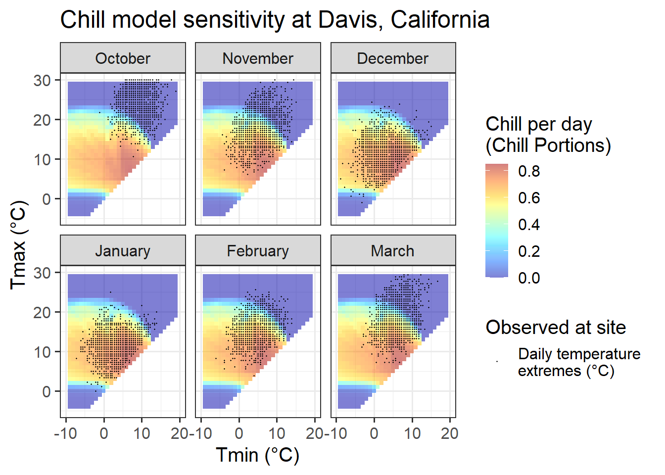
Chill_sensitivity_temps(Model_sensitivities_Sfax,
                        Sfax_weather,
                        temp_model="Dynamic_Model",
                        month_range=c(10,11,12,1,2,3),
                        legend_label="Chill per day \n(Chill Portions)") +
  ggtitle("Chill model sensitivity near Sfax, Tunisia")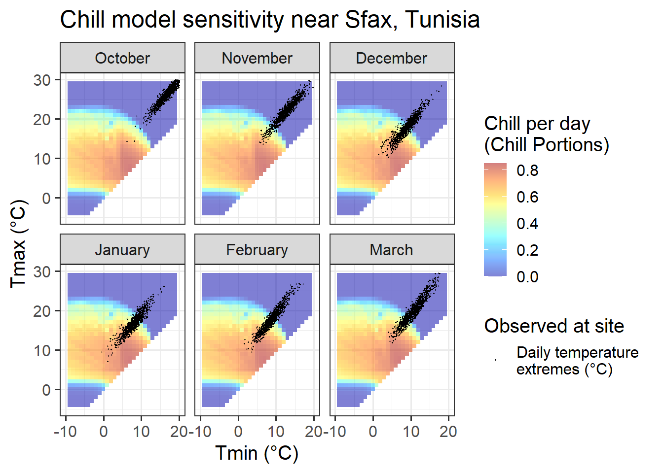
And here are the plots for heat accumulation:
Chill_sensitivity_temps(Model_sensitivities_Davis,
                        Beijing_weather,
                        temp_model="GDH",
                        month_range=c(12,1:5),
                        legend_label="Heat per day \n(GDH)") +
  ggtitle("Heat model sensitivity at Beijing, China")
Chill_sensitivity_temps(Model_sensitivities_CKA,
                        CKA_temperatures,
                        temp_model="GDH",
                        month_range=c(12,1:5),
                        legend_label="Heat per day \n(GDH)") +
  ggtitle("Heat model sensitivity at Klein-Altendorf, Germany")
Chill_sensitivity_temps(Model_sensitivities_Davis,
                        Davis_weather,
                        temp_model="GDH",
                        month_range=c(12,1:5),
                        legend_label="Heat per day \n(GDH)") +
  ggtitle("Heat model sensitivity at Davis, California")
Chill_sensitivity_temps(Model_sensitivities_Sfax,
                        Sfax_weather,
                        temp_model="GDH",
                        month_range=c(12,1:5),
                        legend_label="Heat per day \n(GDH)") +
  ggtitle("Heat model sensitivity near Sfax, Tunisia")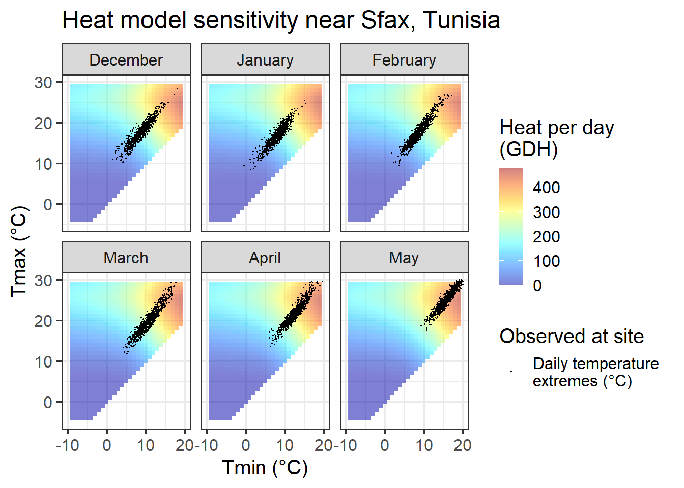
Now we can look at the response patterns in relation to the sensitivity of chill and heat models. Let’s start with the chill model.
23.3 Chill model sensitivity vs. observed temperature
Even though we know that chill model sensitivity depends on hourly temperatures, which in turn are influenced by sunset and sunrise times, the sensitivity patterns appear almost identical across all the locations. There are in fact minor differences, but these are not particularly meaningful.
What does differ between the sites is the ‘location’ of observed hourly temperatures in relation to the sensitive periods. This also varied between months of the year.
23.3.1 Beijing, China
For Beijing, we can see that observed temperatures in October are quite equally distributed between temperature situations we expect to be effective for chill accumulation and situations that are too warm. Such a setting may generate chill-related signals that may cause a meaningful response in bloom dates.
For the next month, November, the situation looks entirely different. Almost all temperature values are within a temperature range that is highly effective for chill accumulation. Even though temperatures vary considerably, chill accumulation rates are very similar for most days in November. Assuming that our chill model is accurate, all these days would thus create similar chill signals. Without meaningful variation, we should not expect PLS to produce useful results.
In December, January and February, temperatures are even lower, so that now we have many hours that are colder than the effective chill accumulation rate. Assuming that the Dynamic Model accurately captures the chill accumulation behavior at the low-temperature end (which I’m not convinced about), we may see a response here.
March is similar to November, in that temperatures are almost always nearly optimal for chill accumulation.
In summary, conditions in Beijing should allow fairly good identification of chill effects in most months, but probably not in November.
23.3.2 Klein-Altendorf, Germany
Temperatures at Klein-Altendorf are possibly less ideal than those in Beijing for PLS-based delineation of the chilling period. Like in Beijing, we also have both optimal and suboptimal temperatures in many months, but the share of days with suboptimal chill conditions is considerably lower than in Beijing. In October, December, January and February, the majority of all days had almost optimal chill conditions, with relatively few days being either too warm (mainly in October) or too cold for chilling.
In November and March, almost all days are near the optimal chill accumulation range.
Klein-Altendorf may thus be a fairly unpromising location for delineating temperature response phases with PLS regression analysis.
23.3.3 Davis, California
Davis offers more favorable conditions in terms of the distribution of daily temperatures across chill model sensitivity levels, at least for some winter months. In November and March, days are about equally distributed among effective and ineffective chill accumulation settings. In February, most days are optimal, with relatively few low-chill (or zero-chill) days. January and December largely feature optimal conditions for chill accumulation. This may compromise the ability of PLS regression to detect signals.
In summary, Davis offers better conditions than the colder locations, but may still face some limitations to the application of PLS regression to delineate response phases.
23.3.4 Sfax, Tunisia
In Sfax, finally, we see temperature settings that favor PLS regression for all months between December and February. Also in November and March, temperature conditions may evoke a chill signal, though the proportion of days during which chill is effectively accumulated is much smaller than in the other months. We should not expect much of a signal in October, when temperatures are consistently too high for chill accumulation.
23.4 Heat model sensitivity vs. observed temperature
In comparison to the Dynamic Model, the temperature response of the Growing Degree Hours model is pretty unspectacular. Any day with a minimum temperature above 4°C contributes to heat accumulation, and the warmer it gets, the stronger the response. Between December and May, such days are rare in December, January and February in Beijing, but quite abundant in all other months at this location, and in all months at the other site.
In summary, across our four study sites, we can rarely observe months that would limit the ability of PLS regression to identify heat accumulation phases. This may in part explain why it has generally been easier to delineate the ecodormancy phase (when heat accumulates) than the endodormancy periods (when chill accumulates).
Exercises on expected PLS responsiveness
Please document all results of the following assignments in your learning logbook.
- Produce chill and heat model sensitivity plots for the location you focused on in previous exercises.
- Look at the plots for the agroclimate-based PLS analyses of the ‘Alexander Lucas’ and ‘Roter Boskoop’ datasets. Provide your best estimates of the chilling and forcing phases.