Chapter 22 Successes and limitations of PLS regression analysis
Learning goals for this lesson
- Learn about the mixed success of applying PLS regression in various contexts
- Understand important limitations of PLS regression
22.1 PLS regression
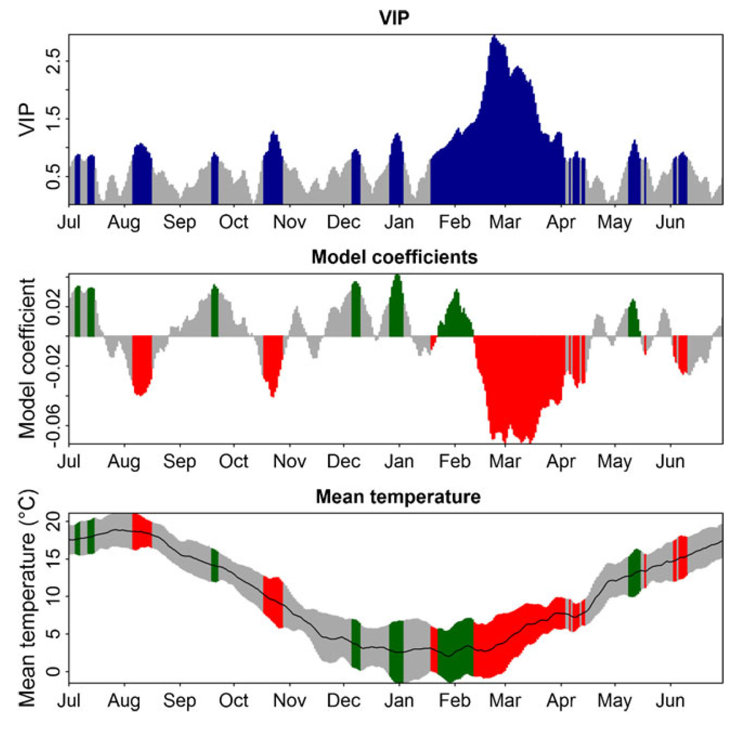
We learned about Projection-to-Latent-Structures (PLS) regression (also known as Partial Least Squares regression) in the previous lesson on Delineating temperature response phases with PLS regression. In the context of phenology analysis, we can use this method to correlate high-resolution temperature data (e.g. daily data) with low-resolution (annual) data on the timing of phenology events. We realized already, however, that in the case of pears at Klein-Altendorf we were only really able to recognize the forcing period (where warm conditions advance bloom), while the chilling phase remained obscure. This was a bit disappointing, because the two dormancy phases had emerged quite clearly in the study on walnut leaf emergence in California. Let’s look at a few more examples to understand where and when this works - and to try to figure out why.
22.2 PLS examples
22.2.1 Grasslands on the Tibetan Plateau
In one of our first applications of the PLS methodology, we evaluated the temperature responses of grasslands on the Tibetan Plateau. Specifically, we looked at how the beginning of the growing season has responded to climate change. When we just look at the trend over time, the pattern that emerges is rather confusing, with a fairly clear advancing trend until the late 1990s, followed by a surprising delay in ‘green up’ dates.
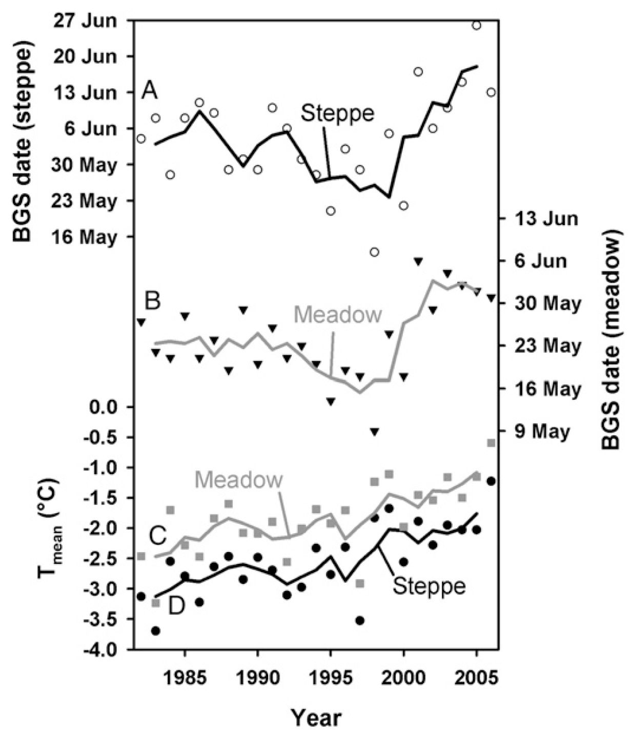
Similar to what we found for walnuts in California, we detected a conspicuous relationship between warm temperatures in winter and delayed beginning of the growing season in spring.
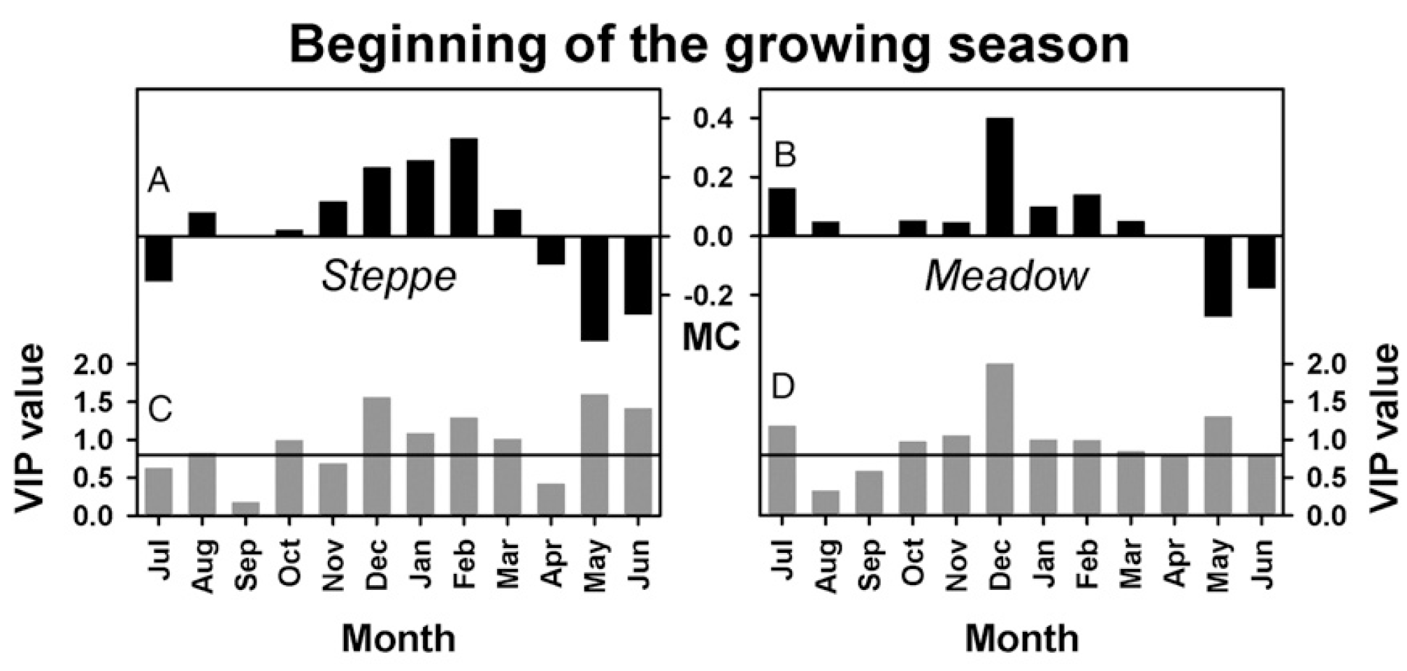
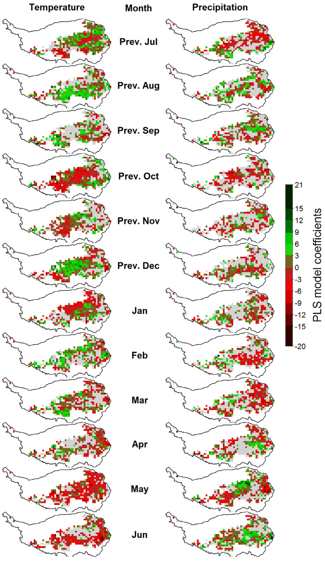
We later added a spatial component to this analysis, investigating vegetation responses to temperature on a pixel-by-pixel basis.
In principle, the temperature response pattern of grasslands is thus similar to what we’ve seen for walnuts in California. The mechanisms at work here are probably quite different, so we should not jump to conclusions here without adequate knowledge of grassland ecology (which I don’t have). These findings are concerning, however, because our initial expectation would probably have been that increasing temperature allows vegetation to get going earlier in the year. Failure of the vegetation to keep up with increasingly available thermal resources indicates a possible mismatch of the established ecosystems with future climatic conditions. Such a mismatch is usually not sustainable, and it may open opportunities for invasive species that are better able to exploit the climatic ‘resources’ that will be available in the future. Well, since I don’t know much about what’s going on here ecologically, I’ll stop speculating here. Let’s rather turn our focus back to deciduous trees.
22.2.2 Deciduous trees
In many of the early PLS analyses of tree phenology, I collaborated with Guo Liang, who was then a PhD student at the Kunming Institute of Botany in China (working in the group of Xu Jianchu, who also runs the regional office of World Agroforestry that is responsible for East and Central Asia). Guo Liang has since become a Full Professor, now running his own group at Northwest A & F University of China.
In his first analysis, Guo Liang looked at the phenology of Chinese chestnuts [https://en.wikipedia.org/wiki/Castanea_mollissima] grown in Beijing, China. Here are the findings:
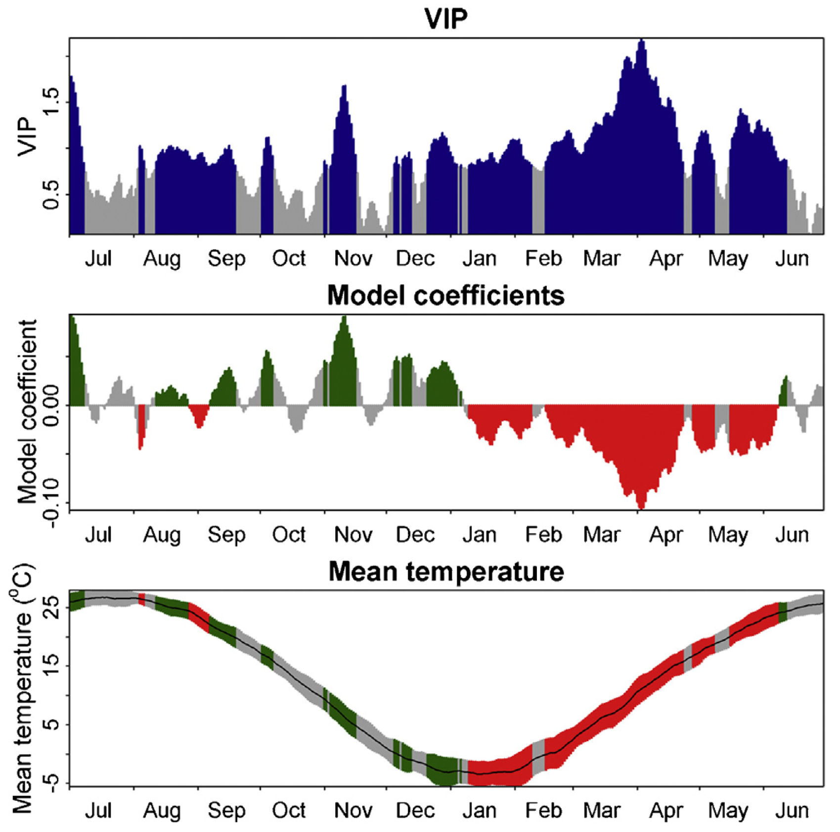
Once again, we can quite clearly see the forcing period - the long period of consistent negative model coefficients from January to May. The chilling period is also somewhat visible, but model coefficients are much less consistent, with many ‘unimportant’ values and even some interruptions.
A similar analysis of cherry phenology from Campus Klein-Altendorf produced quite similar results:
Also here, we see the pronounced forcing phase, which follows a chilling period that is difficult to delineate.
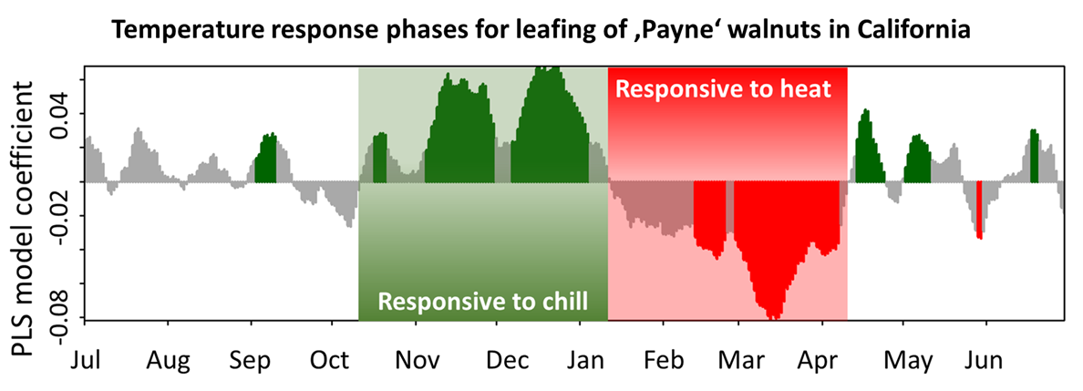
A common pattern that emerges here is that the forcing phase is clearly visible, while the chilling phase is hard to see. This is disappointing after the very clear pattern we found earlier in California:
22.2.3 Why we’re not seeing the chilling phase
Does failure of the chilling phase to show up in the output of the PLS regression indicate that the method isn’t as useful for this purpose as we initially thought? Well, let’s not give up so easily, but rather look at what exactly PLS is sensitive to.
In the spider mite example, PLS regression was sensitive to the quantity of reflected radiation that reached the sensor, with greater reflectance at certain wavelengths and lower reflectance at other wavelengths indicating mite damage severity. In detecting the forcing phase, PLS responded to temperature, with higher temperatures indicating greater heat accumulation, which was in turn related to early bloom.
In all of these cases, changes in the response variable were monotonically related to changes in the signal, i.e. the greater the signal, the greater/smaller the response. The following figure illustrates why this doesn’t work for chill accumulation. Let’s look at the temperature ranges that the chill models respond to and compare this to the temperature range that we can observe at the three study locations during the winter months.
To determine the range of effective temperatures for the various chill models we’ve already worked with, let’s see how much chill they produce at various levels of constant temperatures (I’m ommitting chill days here, because this model doesn’t work with constant temperatures):
library(chillR)
library(dormancyR)
library(ggplot2)
library(kableExtra)
library(patchwork)


hourly_models <-
  list(
    Chilling_units = chilling_units,
    Low_chill = low_chill_model,
    Modified_Utah = modified_utah_model,
    North_Carolina = north_carolina_model,
    Positive_Utah = positive_utah_model,
    Chilling_Hours = Chilling_Hours,
    Utah_Chill_Units = Utah_Model,
    Chill_Portions = Dynamic_Model)

daily_models <-
  list(
    Rate_of_Chill = rate_of_chill,
    Exponential_Chill = exponential_chill,
    Triangular_Chill_Haninnen = triangular_chill_1,
    Triangular_Chill_Legave = triangular_chill_2)

metrics <- c(names(daily_models),
             names(hourly_models))

model_labels <- c("Rate of Chill",
                  "Exponential Chill",
                  "Triangular Chill (Häninnen)",
                  "Triangular Chill (Legave)",
                  "Chilling Units",
                  "Low-Chill Chill Units",
                  "Modified Utah Chill Units",
                  "North Carolina Chill Units",
                  "Positive Utah Chill Units",
                  "Chilling Hours",
                  "Utah Chill Units",
                  "Chill Portions")


for(T in -20:30)
 {
  hourly <- sapply( hourly_models,
                    function(x)
                      x(rep(T,1000))
                    )[1000,]

  temp_frame <- data.frame(Tmin = rep(T,1000),
                           Tmax = rep(T,1000),
                           Tmean = rep(T,1000))

  daily <- sapply( daily_models,
                   function(x)
                     x(temp_frame)
                   )[1000,]

  if(T == -20)
    sensitivity <- c(T = T,
                     daily,
                     hourly) else
      sensitivity <- rbind(sensitivity,
                           c(T = T,
                             daily,
                             hourly))
  }

sensitivity_normal <-
  as.data.frame(cbind(sensitivity[,1],
                      sapply(2:ncol(sensitivity),
                             function(x)
                               sensitivity[,x]/max(sensitivity[,x]))))

colnames(sensitivity_normal) <- colnames(sensitivity)

sensitivity_gg <-
  sensitivity_normal %>%
  pivot_longer(Rate_of_Chill:Chill_Portions)

 # melt(sensitivity_normal,id.vars="T")
sensitivity_gg$value[sensitivity_gg$value<=0.001] <- NA


chill<-
  ggplot(sensitivity_gg,
         aes(x = T,
             y = factor(name),
             size = value)) +
  geom_point(col = "light blue") +
  scale_y_discrete(labels = model_labels) +
  ylab("Chill model") +
  xlab("Temperature (assumed constant, °C)") +
  xlim(c(-30, 40)) +
  theme_bw(base_size = 15) +
  labs(size = "Chill \nWeight")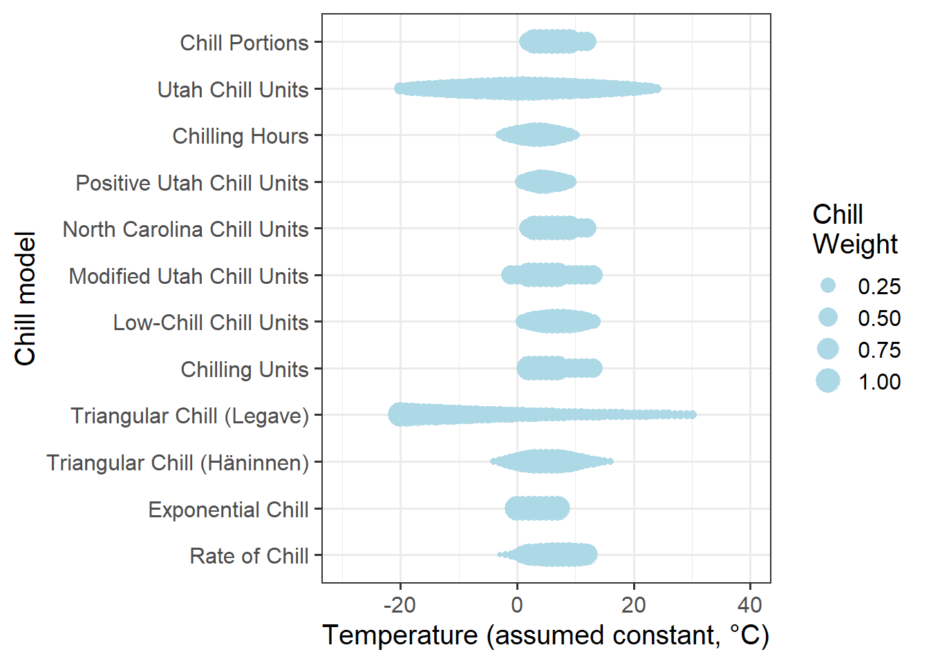
Now let’s summarize winter temperatures at the three locations for which we’ve seen phenology responses above: Klein-Altendorf (Germany), Beijing (China) and Davis (California). You can use the following buttons to download the temperature data. If you save them in the data subfolder of your working directory, all the code below should work well.
KA_temps <- read_tab("data/TMaxTMin1958-2019_patched.csv") %>%
  make_JDay() %>%
  filter(JDay > 305 | JDay < 90) %>%
  stack_hourly_temps(latitude = 50.6)


hh_KA <- hist(KA_temps$hourtemps$Temp,
              breaks = c(-30:30),
              plot=FALSE)

hh_KA_df <- data.frame(
  T = hh_KA$mids,
  name = "Klein-Altendorf, Germany",
  value = hh_KA$counts / max(hh_KA$counts))

hh_KA_df$value[hh_KA_df$value == 0] <- NA


Beijing_temps <- read_tab("data/Beijing_weather.csv") %>%
  make_JDay() %>%
  filter(JDay > 305 | JDay < 90) %>%
  stack_hourly_temps(latitude = 39.9)

hh_Beijing <- hist(Beijing_temps$hourtemps$Temp,
                   breaks = c(-30:30),
                   plot=FALSE)

hh_Beijing_df<-data.frame(
  T = hh_Beijing$mids,
  name = "Beijing, China",
  value = hh_Beijing$counts / max(hh_Beijing$counts))

hh_Beijing_df$value[hh_Beijing_df$value==0]<-NA


Davis_temps <- read_tab("data/Davis_weather.csv") %>%
  make_JDay() %>%
  filter(JDay > 305 | JDay < 90) %>%
  stack_hourly_temps(latitude = 38.5)


hh_Davis <- hist(Davis_temps$hourtemps$Temp,
              breaks = c(-30:40),
              plot=FALSE)

hh_Davis_df <- data.frame(
  T = hh_Davis$mids,
  name = "Davis, California",
  value = hh_Davis$counts / max(hh_Davis$counts))

hh_Davis_df$value[hh_Davis_df$value == 0] <- NA


hh_df<-rbind(hh_KA_df,
             hh_Beijing_df,
             hh_Davis_df)

locations<-
  ggplot(data = hh_df,
         aes(x = T,
             y = name,
             size = value)) +
  geom_point(col = "coral2") +
  ylab("Location") +
  xlab("Temperature (between November and March, °C)") +
  xlim(c(-30, 40)) +
  theme_bw(base_size = 15) +
  labs(size = "Relative \nfrequency")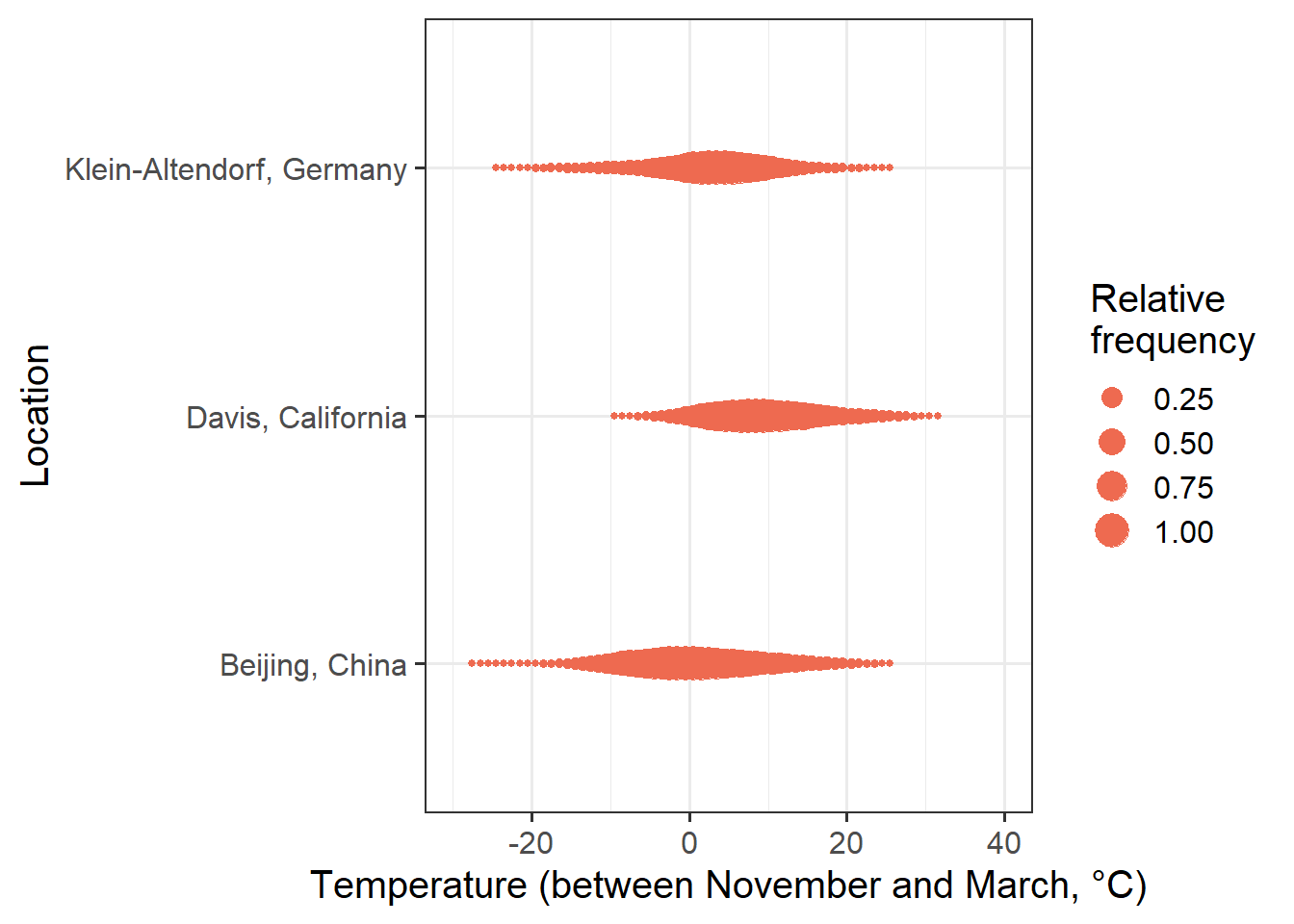
To compare the plots, let’s combine them in one figure (using the patchwork package):
  plot <- (chill +
             locations +
             plot_layout(guides = "collect",
                         heights = c(1, 0.4))
           ) & theme(legend.position = "right",
                     legend.text = element_text(size = 10),
                     legend.title = element_text(size = 12))

plot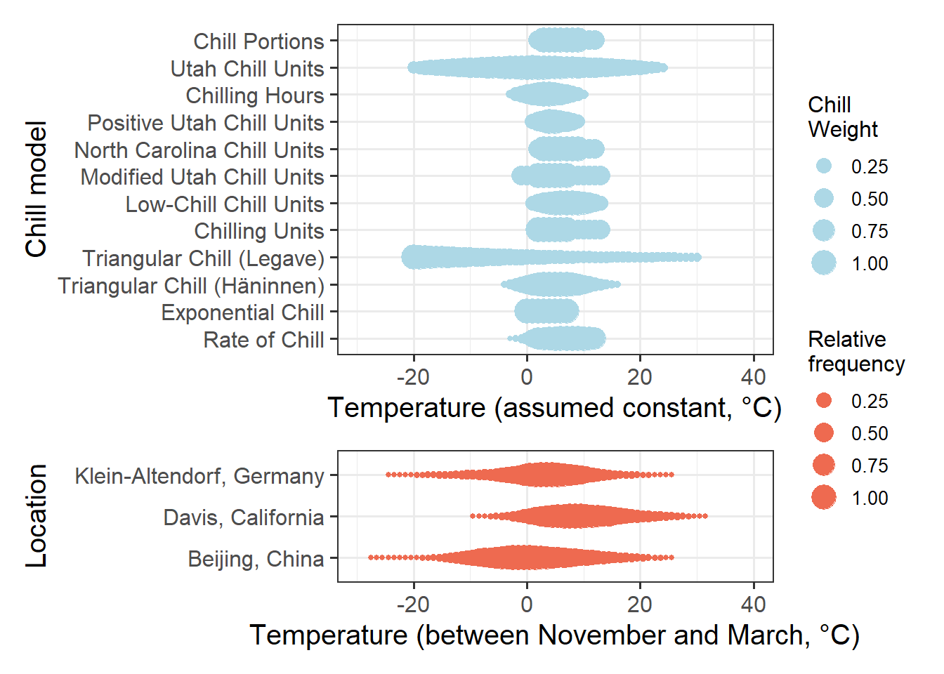
We already realized earlier that some of these models are probably pretty poor. So let’s simplify by only plotting chill according to the Dynamic Model:
chill <-
  ggplot(sensitivity_gg %>%
           filter(name == "Chill_Portions"),
         aes(x = T,
             y = factor(name),
             size=value)) +
  geom_point(col = "light blue") +
  scale_y_discrete(labels = "Chill Portions") +
  ylab("Chill model") +
  xlab("Temperature (assumed constant, °C)") +
  xlim(c(-30, 40)) +
  theme_bw(base_size = 15) +
  labs(size = "Chill \nWeight")

  plot<- (chill +
            locations +
            plot_layout(guides = "collect",
                        heights = c(0.5,1))
        ) & theme(legend.position = "right",
                  legend.text = element_text(size = 10),
                  legend.title = element_text(size = 12))

plot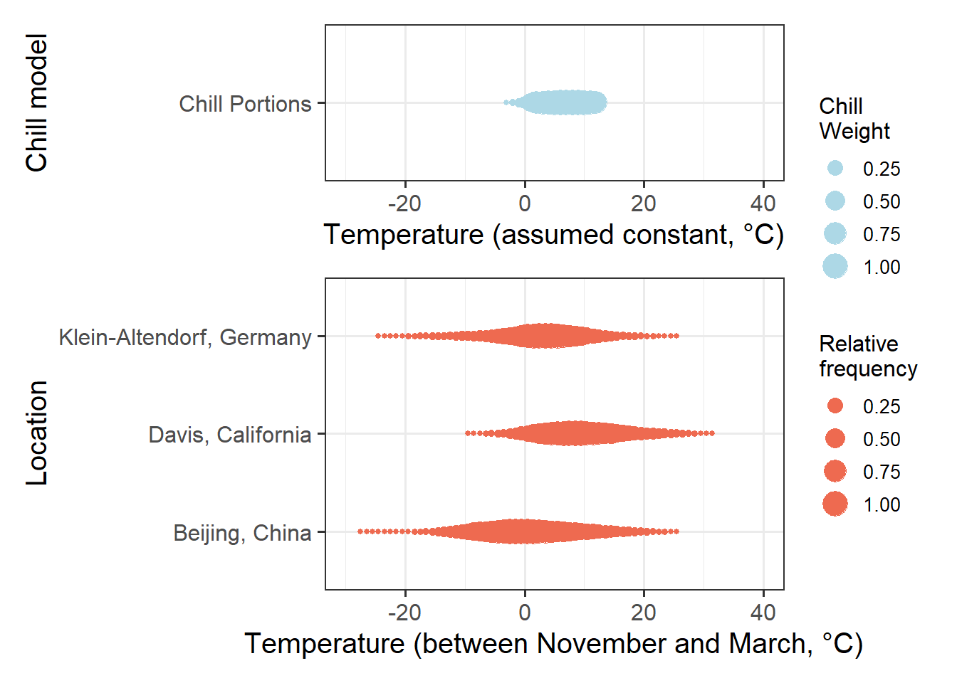
If we compare the effective chill ranges with winter temperatures at the three locations, we can see that in Klein-Altendorf and Beijing, temperatures are quite often cooler than the effective temperature range for chill accumulation. At Davis, this is rarely the case. Temperatures that are too warm for chill accumulation occur quite frequently at Davis, and occasionally at the other two locations.
This means that at Davis, it is reasonable to expect that warm temperatures in winter reduce chill accumulation. In the other two locations, this is not always the case. When it is relatively cold, warming may actually increase chill. When temperatures are relatively high, however, chill accumulation would be reduced by warming. At these two locations, there is thus no monotonic relationship between temperature and chill accumulation. In such a setting, we shouldn’t expect PLS regression to produce clear results.
In the next chapter, we’ll learn about a way to overcome this problem.
Exercises on chill model comparison
Please document all results of the following assignments in your learning logbook.
- Briefly explain in what climatic settings we can expect PLS regression to detect the chilling phase - and in what settings this probably won’t work.
- How could we overcome this problem?